Beyond the curve: Dr. Peter Lurie's COVID-19 blog
To hear the administration’s recent pronouncements, you’d think it was all going swimmingly. Vice President Mike Pence took to the always welcoming opinion pages of the Wall Street Journal last week to declare that “we are winning the fight against the invisible enemy.” On Friday, he maintained that states are reopening “safely and responsibly,” though at an event in Dallas on Sunday even he had to retreat from the he-man posture by donning a mask. Not to be outdone, the President proclaimed in an interview last Wednesday that the virus is “dying out.”
Are you following the same pandemic I am? Mine looks like this (from the New York Times):

Does this look like a virus that is dying out? Does this look like victory to you?
Predictably, the administration came armed with an evidence-free explanation: the problem is more testing, not more virus, tempting the President to flirt with “slow[ing] the testing down.” Right. And if we remove climate change information from the EPA’s website, as the administration has done, the earth’s temperature will stop climbing.
Sure, there might be some increased case detection due to (finally) increased testing. But how does that explain the increasing proportion of tests that are turning up positive? (That metric should go down as less risky people come forward to be tested when more tests became available.) Or the increases in hospitalizations in some states that also have rising case numbers?
The fact is we are witnessing a disaster in both domestic and global terms.
Let’s start at home, using data from the Washington Post’s website. First, let’s look at the toll to date in each state. Unlike a lot of the data you see presented, let’s look at the data adjusted for underlying population sizes. If the data are presented this way, the top ten most affected states and the associated numbers of deaths look like this, as of June 29:
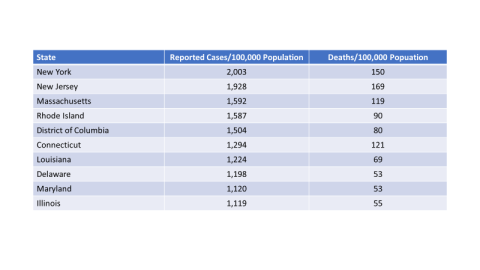
These ten states, which account for about 40% of all cases in the U.S. to date, are primarily concentrated in the Northeast.
But if we look instead at where the epidemic is growing fastest, measured by the percentage of all cases in each state that have occurred since June 23, we see a very different picture:
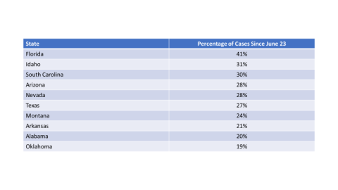
There is no overlap between the states with the historically largest overall outbreaks and those where it is now growing fastest. So as the initial epidemic is on the wane, controlled largely by the adoption of social distancing, hand-washing, and masks, it is being succeeded by a new epidemic in parts of the country that were largely spared at first. The top ten fastest growing states account for about 20% of all cases to date. Expect that to grow. (Admittedly, it is easier to have a high percentage increase if your state was relatively spared in the initial phase of the epidemic, but the overall point still holds. The two most heavily affected states overall, New York and New Jersey, together totaled 5,383 cases since June 23, compared to 42,838 cases during that same period in Florida alone.)
Now let’s turn to the global situation. Tragically, it’s even worse. Here’s the latest global count of daily coronavirus cases (again from the New York Times).

Absolutely frightening. Next, we’ll take a similar approach to analyzing the data as we did for the U.S., using data from the Worldometers website. Let’s start by recognizing that the U.S. and Brazil, two countries whose leaders responded with a toxic melange of denialism and data-free policies, represent almost two-fifths of cases worldwide to date, even though they hold only 7% of the world’s inhabitants. But the toll on the ground is best measured in per capita cases and deaths, again all through June 29:
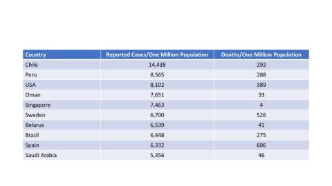
Although the U.S. is heavily affected, the countries with the highest per capita rates (among those countries with populations of at least five million) are actually Chile and Peru. We’ll focus on the case rates, because some of the death rates are suspiciously low (hello Oman, hello Singapore).
We wanted to calculate the percentage of cases that are recent the way we did for the U.S., but the data on the most recent cases appear to be erratically reported internationally. Instead, we’ll confine ourselves to the countries with the largest numbers of recent cases (June 28) and report results for them only (some countries, none large, are missing data for June 28). The data look like this:
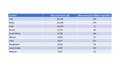
From this analysis, we learn that there are still more new cases per day in the U.S. than anywhere else in the world (a few days ago, the U.S. was second behind Brazil), although the largest number of new per capita cases is in Chile, followed by the U.S. and Brazil. This is where the burden of current infections is hitting hardest.
Unless you’re the Trump administration or the Bolsonaro administration in Brazil, there is no way to sugarcoat this. This pandemic is raging in new parts of the U.S. and in a growing number of countries around the world.
Let’s try to end on as optimistic a note as the data permit. What has been done so far to stem the tide has been successful in states like New York and New Jersey and countries like Italy and France, which don’t even appear in these data. This means we know what to do to slow the spread of the virus: governments must face the facts, engage in straight talk with their populations, and implement policies derived from evidence-based science. Until there is a vaccine, that is our only hope.
Contact Info: Contact us at cspinews[at]cspinet.org with questions, ideas, or suggested topics.